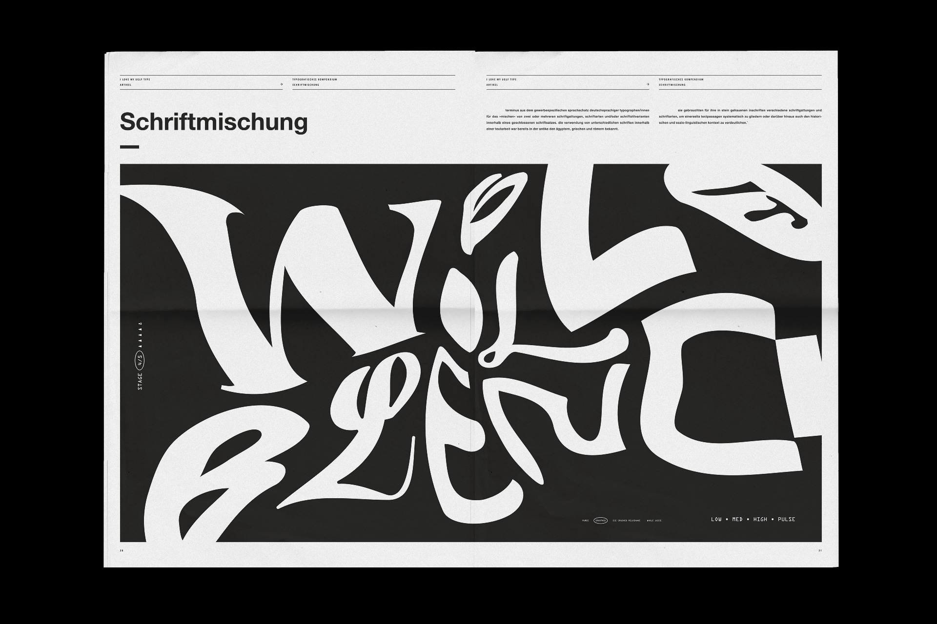
I love my ugly type - newspaper magazin
a Ekel über verschiedene Sinne aufgenommen wird und einer der wichtigsten, das Riechen fehlt. Erfolgt die Gefühlsaktivierung durch die visuelle Ebene. Das Magazin richtet sich an Designer welche durch ihre Lehre und Erfahrung, eine intuitive Haltung auf Gestaltungsformen besitzen. Diese Haltung gilt es zu testen. Der Leser wird durch einen Spießrutenlauf von typografischer Unartenheiten


The Barcelona City Council commissioned us to oversee the identity of its internal publications, and to come up with mechanisms ensuring that visual consistency would be maintained as new publications were created, independently of the nature of the content or the department involved. Striving to make instructions easy to abide by even by people with no design training whatsoever, the job included creating editable templates in both Adobe InDesign and Microsoft Word, and coming up with a set of style guidelines that could explain each decision in painstaking detail.
The assignment brought up the daunting challenge of creating a functional, recognizable and enduring house style, considering that most of the publications would have to be developed internally by staff members of wildly diverse professional backgrounds – more often than not, far removed from design and creativity. All details and variables had to be taken into account: any oversight otherwise would potentially lead to a progressive deterioration of the publications’visual consistency as a result from staffers making impromptu creative decisions, which would wind up resulting in a loss of the identity and functionality of the proposal. Therefore, for this assignment we worked on the assumption that no decisions should be made on the basis of aesthetics, and that the style and graphic outcome would have to be preceded by a series of functional decisions aimed at guaranteeing the correct implementation, development and evolution of the content.
In terms of visual ingredients, our proposal sought to minimize the resources used to generate a solid, coherent and versatile editorial language through the use of a handful structural elements: type, color, and some general parameters on the distribution of negative space.
The outcome is a collection of functional, expandable, and dynamic publications with a recognizable identity that equips staff members, by observing a series of concrete guidelines, to generate an array of documents in line with the collection’s house style – even with no design background.